Designs by exactly. (@exactlydesign), photos by @linneaphoto (unless otherwise noted)
When the whole wide world of choice exists, especially this day in age, how does one choose a direction? It can be hard when you’re building a new house or renovating your existing one, to make a commitment to move forward. We see this a lot when we have an initial meeting with a new client for their midcentury modern project. People put off renovating for months and years because they are afraid to make choices they may regret in a few years-totally understandable when it’s such a huge financial commitment. Hiring an interior designer is a good investment for this very reason. We can help you talk through your insecurities, focus your goals, and create and timeless design that you can be happy with for decades to come. Come on in and let us show you how we do it!

You’ve made it to us because you do know that midcentury modern is your choice in aesthetic. So what’s next? How do we help realize your dream house? Like any good relationship, it starts with listening. We ask you questions like:
- What is your favorite thing about your space?
- How do you use your space?
- What do you want that you don’t have?
- Do you have any art/furniture/heirlooms that you want to incorporate into the design?
- What colors do you like/not like?
- Do you have any inspirational photos of spaces that make you happy?
As a show and tell we’re going to walk you through a whole house project we did for a family in Fenton, Michigan, explaining how the answers to these questions guided the design process.
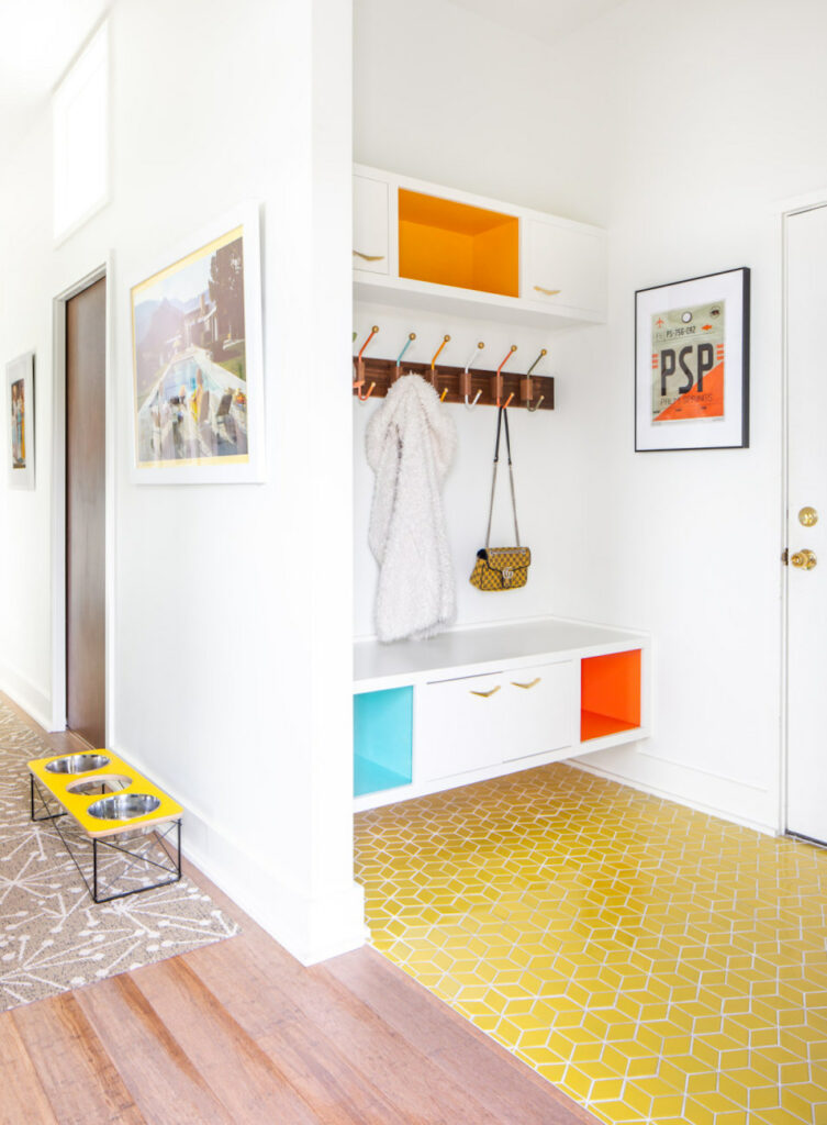
From initial discussions it was clear that this family:
- wanted yellows and greens
- enjoyed atomic designs
- loved Palm Springs and its vibe
So right away, upon entrance, you see nods to Palm Springs, CA, in the artwork and cheerful colors. As we want the design to be cohesive, here is where we introduce other colors you’ll spot throughout the house, too.
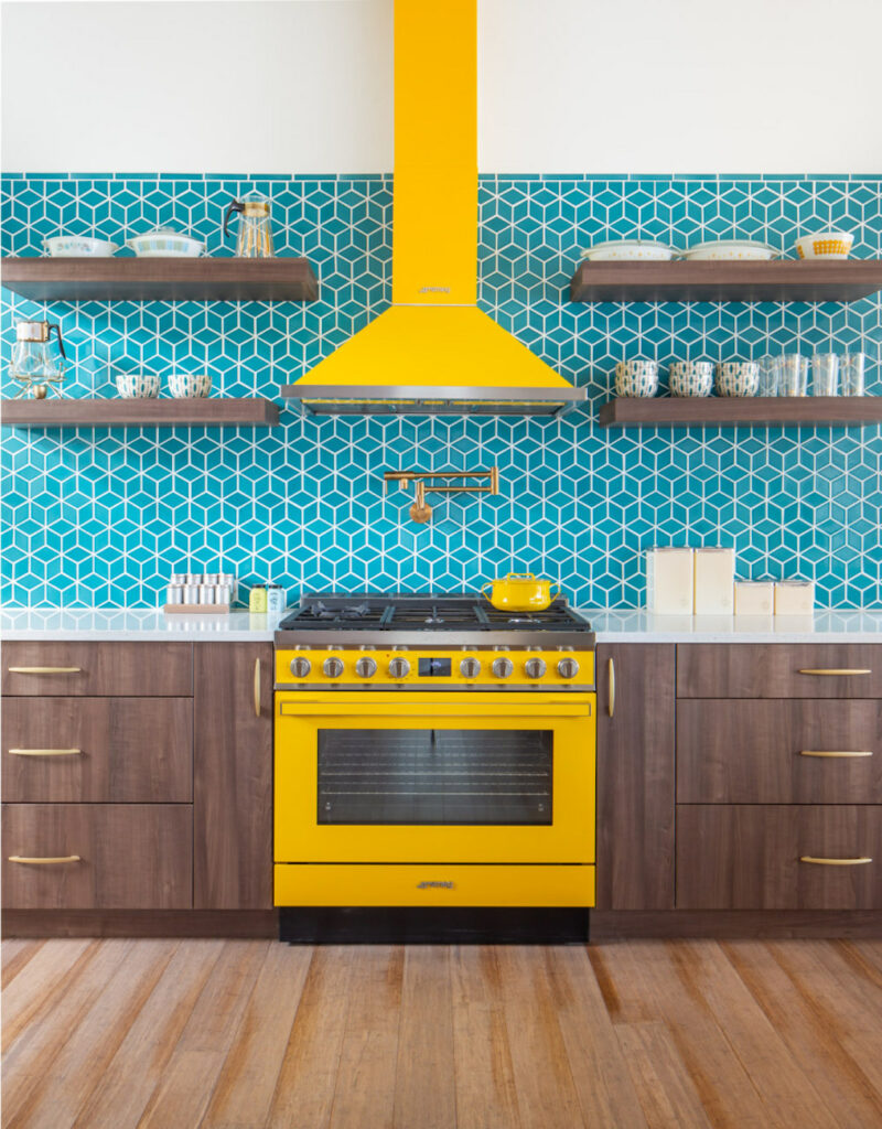
First directive from the client, “I’d like a yellow stove.” Heck yeah, sounds awesome! Ok, let’s pair it with teal and walnut for a Palm Springs punch, add some open shelving to show off that vintage kitchenware, and connect it visually with the dining area.
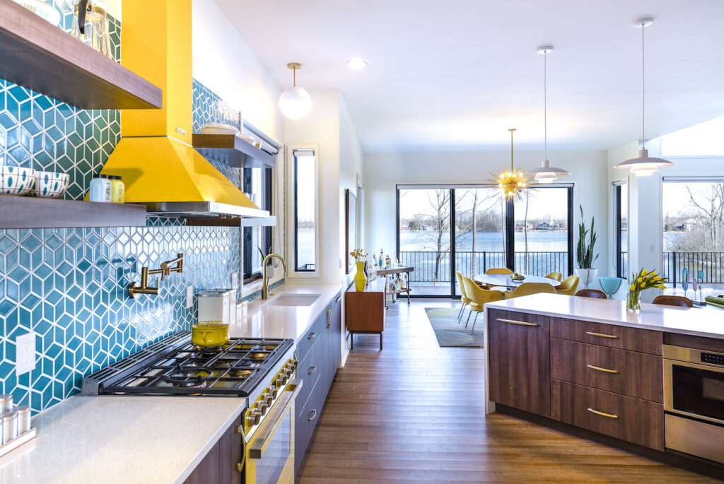
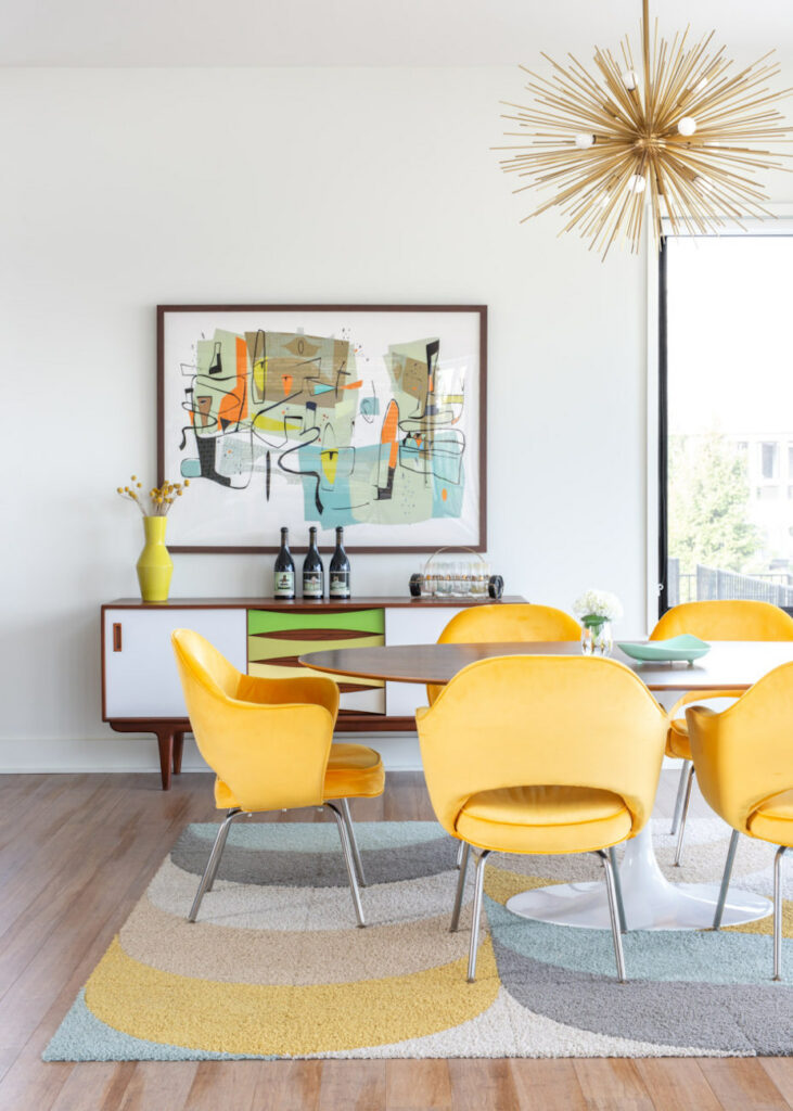
Here we incorporated the first of the atomic lights with a sputnik chandelier, added in a touch of green and continued the orange and teal from the entry way. Notice that as you move around the space, the colors (like the teal and orange) are not the exact same shade. Flow doesn’t mean matchy-matchy, which can actually come off as flat, if overdone. Shades of color can change room to room as long as the effect is cohesive.
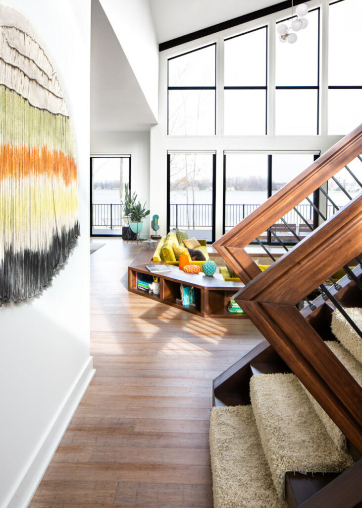
Moving through to the living room, with that glorious sunken couch, you continue to see warm woods and shades of green, yellow, orange and teal in the artwork, textiles and atomic bullet planters.
Heading into the powder room, we start leaning into the greens. The wallpaper led the design here, with tiles, sconces, and vanity details to follow.
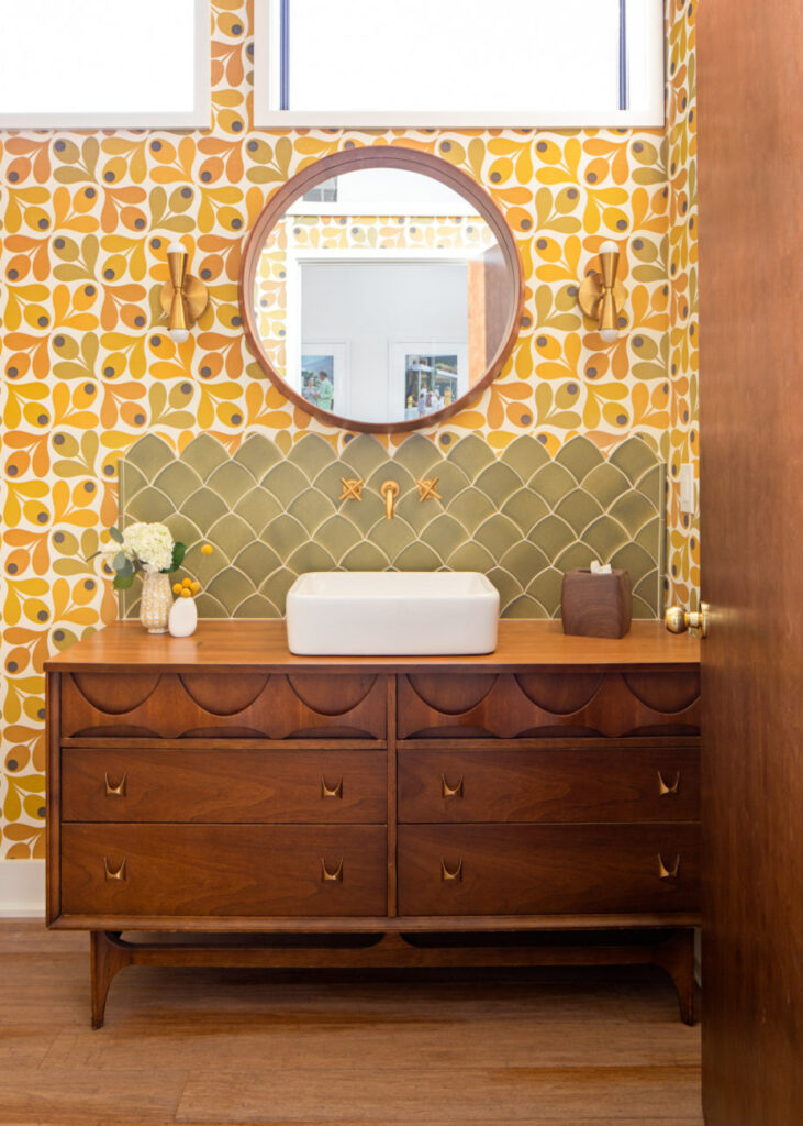
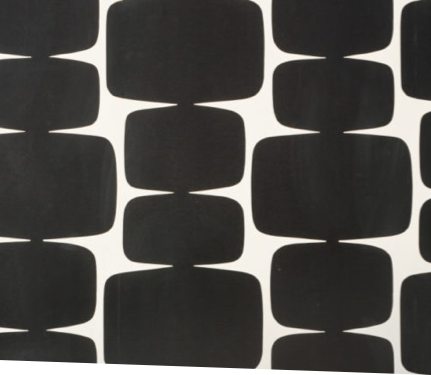
When we presented the client with this tile it was a definite “yes,” so to play up the atomic design we found matching wallpaper and a snappy green tile to match. Their own vintage space-age toys were added, as well as a Palm Springs architectural print and colorful towels to bring it together.
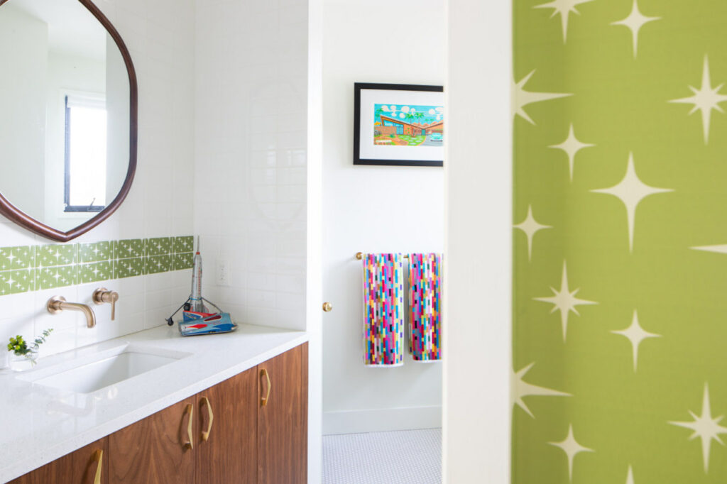
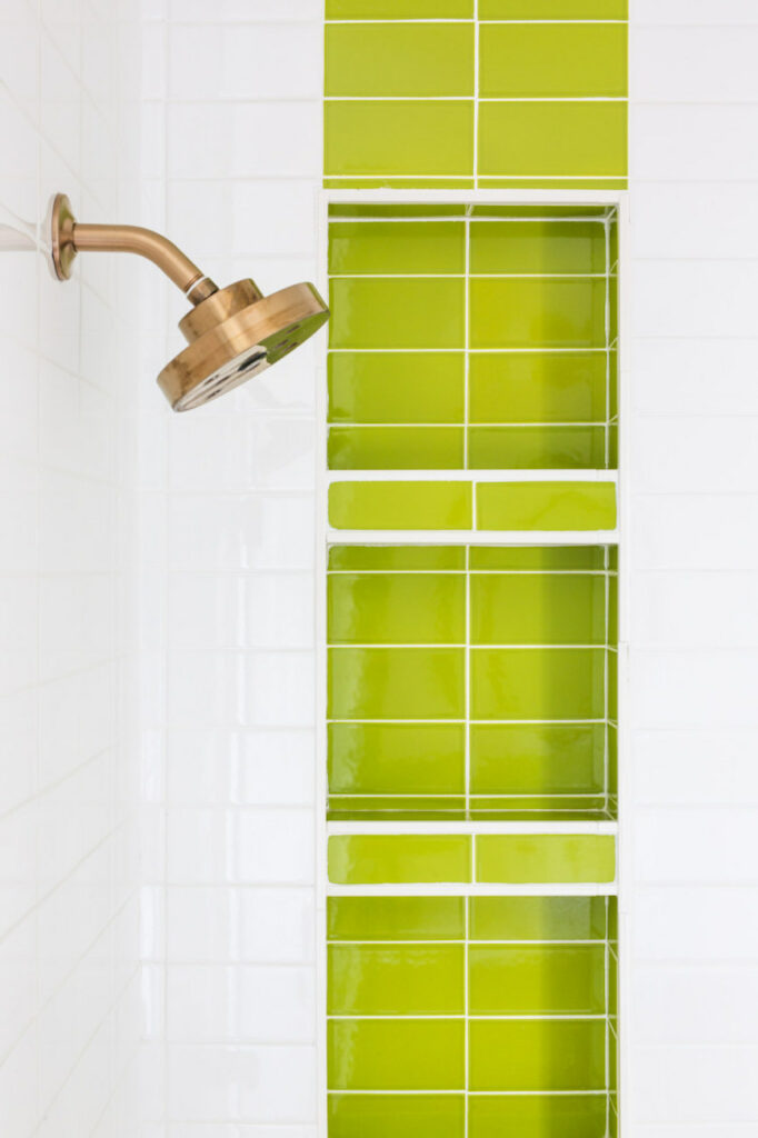
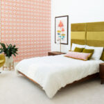
The walnut and yellow from the kitchen and dining room flow into this main level bedroom. To soften things up for sleeping, rounded edges appear in the wallpaper, ball chair and chandelier.
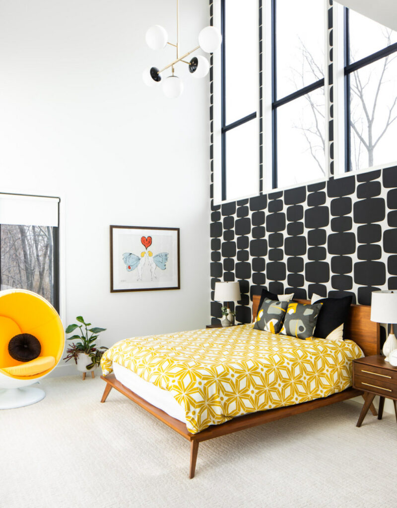
The wallpaper was the first choice made for this bedroom. Zoom in and you’ll see the pretty chartreuse centers in each globe. Globe table lamps and a matching chandelier to the one above continue the theme, as do shades of green.
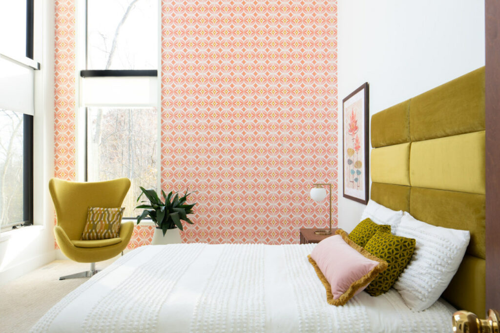
This guest room has all the requirements-starbursts, yellow, and a chill California energy. The wallpaper was the first thing chosen here, with lamps, pillows, artwork and the the beautiful velvet duvet to match.
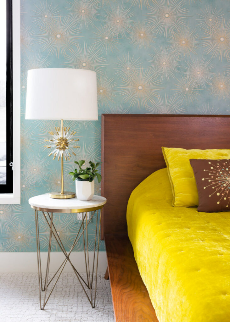
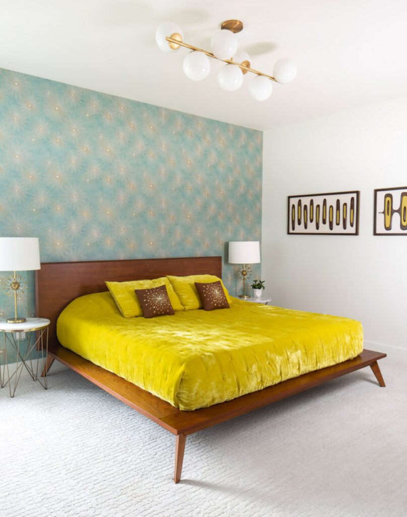
The design for the master bath and bedroom started with this teal starburst tile that the client loved.
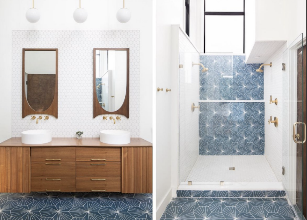
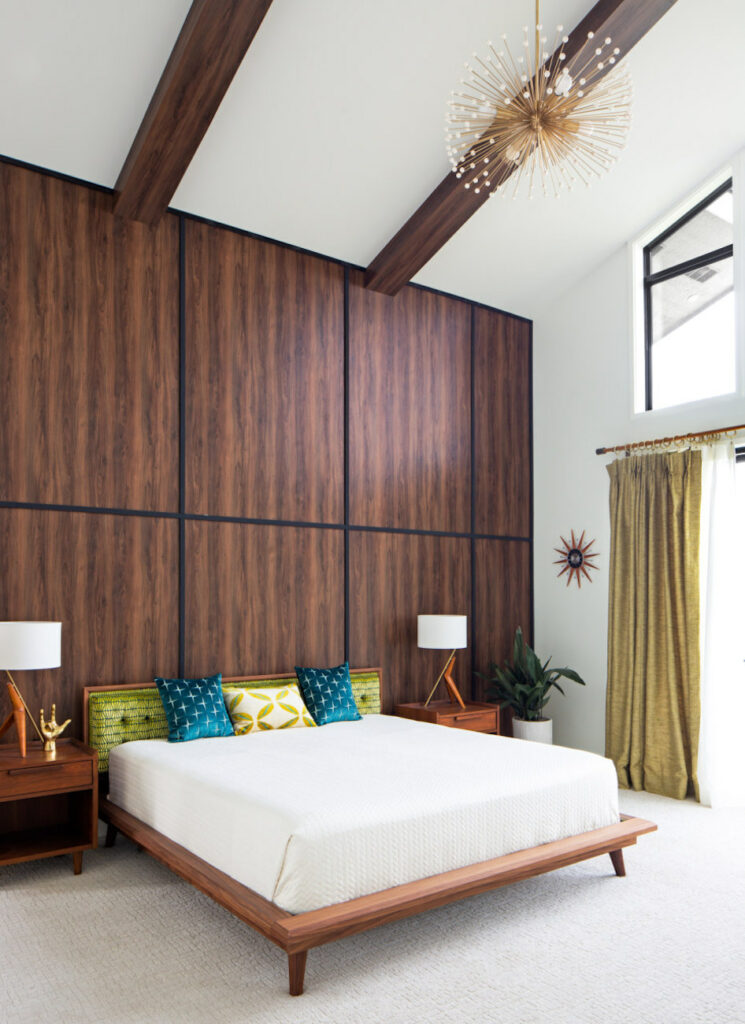
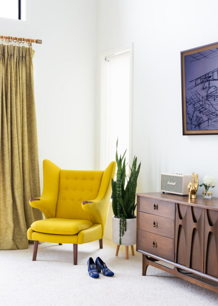
Next to be added to the design was the fabric for the headboard. It picked up the teal from the bathroom tile and continued the green theme. Angled lamps and patterned pillows keep the starburst theme, and yellows come back in with the Papa chair and accent pillow. A more delicate atomic chandelier felt right for the bedroom.
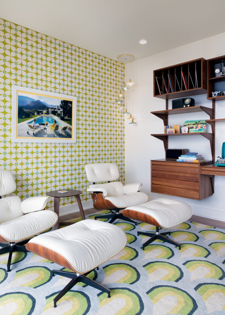
The vintage pendant light was the inspiration for this room. We thought the wallpaper was a perfect backdrop for the poolside print.
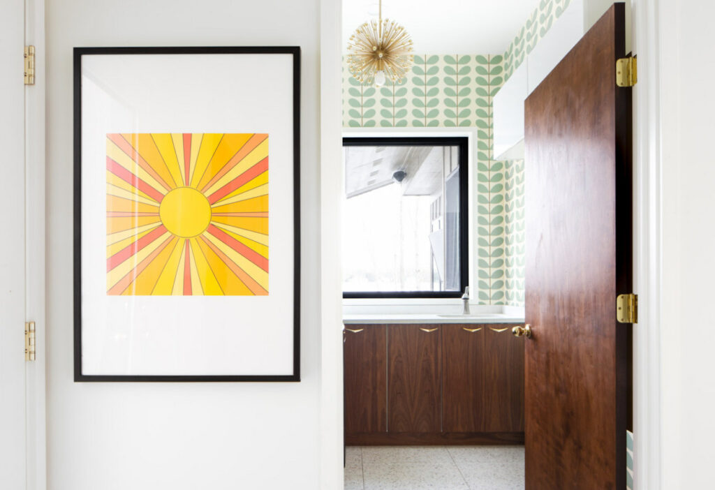
And to round out the design tour we end with the laundry room. This organic themed wallpaper was chosen to bring the outside in. A nod to the Golden state, the sunny print adds a touch of yellow, and a small atomic pendant repeats the image.
We hope this helped illuminate our design process for a midcentury modern home, and possibly gave you some tips as to how to carry a design through your own space. If you’d like to visit the full project page for this home follow the link below. That concludes our tour for now, but…

